Payment transparency and usability upgrades
The little things can make all the difference.
Users of Grubhub experience frustration due to inadequate payment transparency, inability to cancel orders when they are delayed or not yet prepared in the kitchen and overall lacking general usability. As a personal project, I enhanced features of the mobile app to create a more transparent payment experience, order management responsiveness, and overall usability.
Bitter Bites: What Research Uncovered
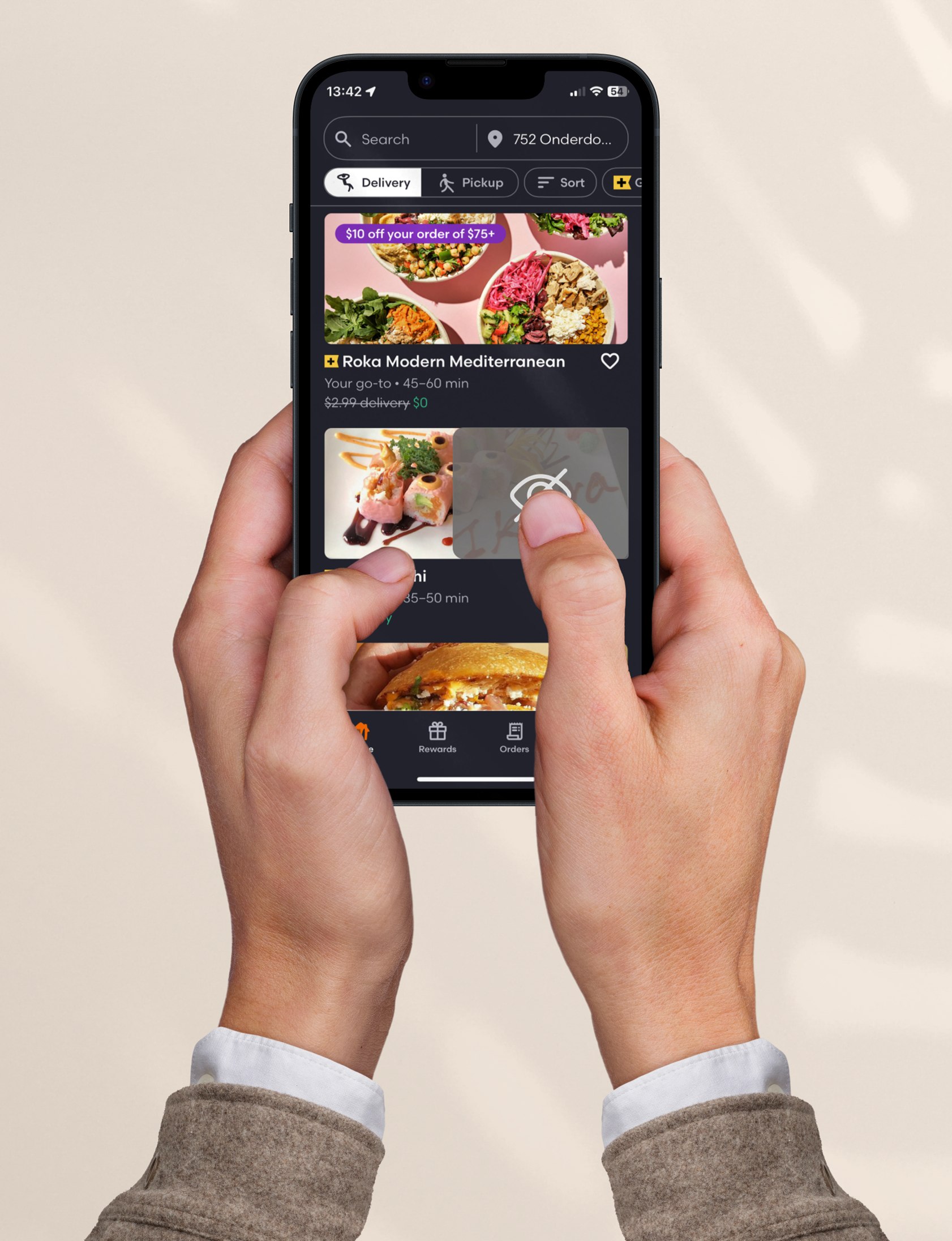
Many users find themselves unknowingly ordering from the same restaurant they've had bad experiences with in the past. Food delivery apps don’t currently offer an option to hide restaurants you've decided not to reorder from. In busy cities with countless options, it’s easy to forget which places didn't meet expectations. Solution: toggle off restaurant photos while keeping the name visible. If you decide to give a restaurant another try, it’s entirely up to you!
Tip, Total, and Transparency on the Menu
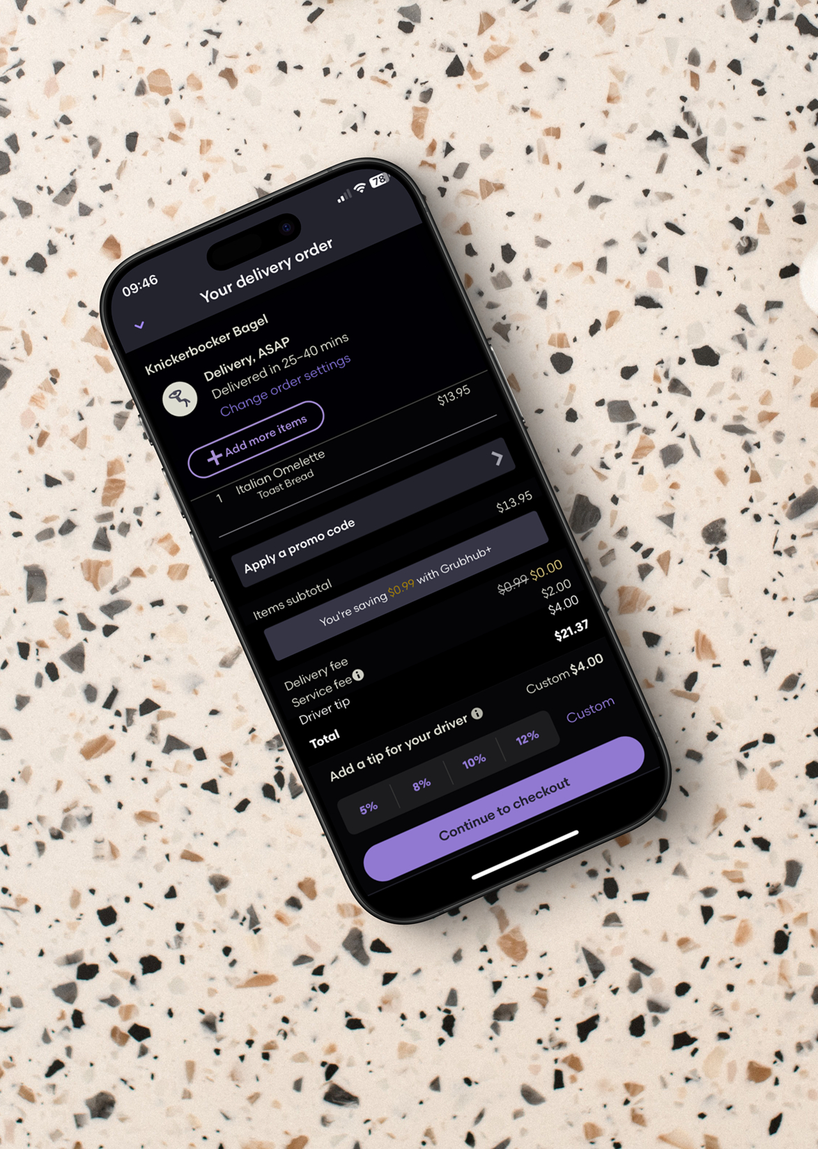
Users expressed frustration due to unclear order and checkout information; for example, the app prompts users to select a tip amount but delays updating the total until the subsequent payment page after a scroll to the very bottom. Solution: once user taps a tip price, the total price updates in real-time, user can then continue to checkout where they can insert promo codes and finish payment.
Users report frustration over the inability to cancel orders in the case of significant delays or when restaurants haven't yet started to prepare the meal after a substantial amount of time has passed. This highlights a need for improved flexibility on GrubHubs side. Implementing a “cancel order” button after a reasonable amount of time lets users end the ordering process so they can start a new order.


